
If you scroll through Instagram Reels, you have probably run into a phone screen where a number in Korean won keeps climbing without pause. One of those clips passed 5 million views, and the app’s name spread along with it. Ige Nae Yeonbong (Korean for “This Is My Salary”) is a free app that shows how much you have earned so far, down to the second, once you enter any one of annual salary, monthly pay, daily pay or hourly pay. It was published by developer JooWon Koh and works on iPhone and Android. According to the version history, its first release date was July 30.
It is an app that took off on a single Reel, with no news coverage and no interview with its creator. EasyTicket installed it on an Android phone, entered a 40 million won annual salary, and went through everything from Home to Settings. Based on that record, we looked at two questions: why the app suited Reels so well, and why turning that buzz into money is hard.
What kind of app is Ige Nae Yeonbong?
The first launch takes three steps. You pick a pay unit (annual, monthly, daily or hourly), type in an amount, and choose when to start counting (every January 1 or a date you set). Then you land on the home screen. No sign-up, login or permission request appeared even once.
When we entered 40 million won, “₩1.26 per second” appeared right away. That figure is 40 million won divided by 365 days a year and 24 hours a day, so it accumulates even through the hours you sleep. The home screen was a white background with one large number. The ₩33,744,372.74 accumulated since January 1 kept rising to two decimal places, and when we looked again about five seconds later it read ₩33,744,388.66.
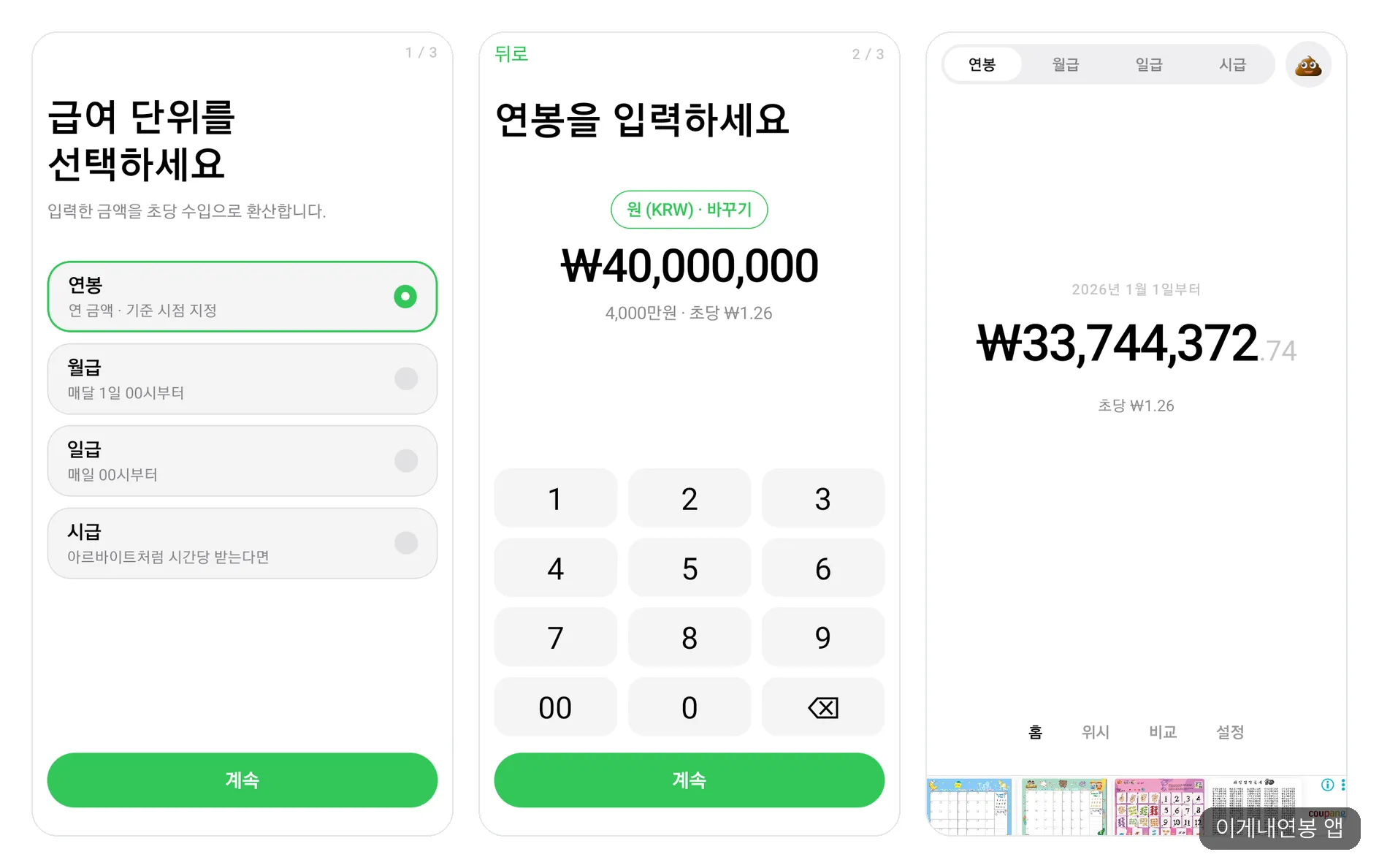
From left: choosing a pay unit, entering a 40 million won salary (₩1.26 per second), and the home screen with a single large number.
The bottom tab bar has four tabs: Home, Wish, Compare and Settings. If you open “Pay and accumulation method” in Settings and choose working hours (weekdays 9 a.m. to 6 p.m. by default) instead of real-time accumulation, the text under the number changes to “Outside work hours · Paused” after hours and the number stops. That confirmed the working-hours calculation described on the App Store page actually works.
As of November 2026, the App Store rating is 4.2 out of 5 (54 ratings), and the app ranks 157th among free apps in the Finance category. No download or revenue figures have been made public.
Why one Reel was played 5 million times
The buzz was created inside Reels from start to finish, so the reasons should be found in what the app shows on video. No news outlet has offered an explanation yet, so what follows is the judgment of someone who used the app.
First, the explanation is done in three seconds. The home screen has nothing on it except the number. Simply filming a phone with a climbing number serves as the app’s introduction. On Reels, the few seconds before a viewer swipes away decide everything, so a screen that needs no explanation is the strongest.
Second, viewers think of their own number. When people see an amount rising on someone else’s screen, most of them first wonder, “How much is mine per second?” With three setup steps and no sign-up, the path from curiosity to installation is short.
Third, it has a scene people want to film. In the Compare tab, we entered a boss named “Boss” with an 80 million won salary, and a race to “one cup of coffee, ₩5,000” opened. After pressing play and waiting about 11 seconds, Boss was at ₩28 and I was at ₩14.42. The screen said Boss would buy a coffee in 32 minutes 51 seconds, while I had 1 hour 5 minutes to go. It puts the old joke about the department head sitting next to you straight onto the screen, which makes it easy to tag a friend.
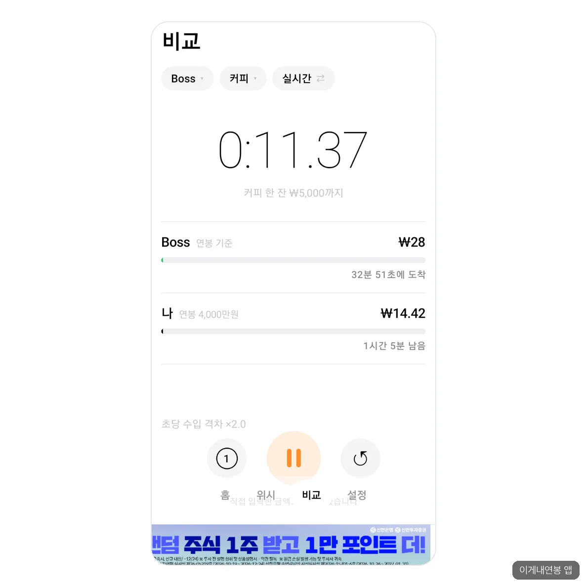
A coffee race against Boss, who earns 80 million won a year. In 11 seconds the gap is already double.
It also does not end with a laugh. One App Store review said that after using the app, they think harder when buying things, writing, “So I have to do this much work to buy this.” It is an experience where prices turn into hours of labor, which makes the content easy to save and share.
We can only guess when it spread, from the version history. After version 1.1.1 on August 18, it was quiet for about a month, and then updates came every few days from September 19 through the end of October. In between are “bug fixes based on reviews” (September 25) and “heat reduction” (September 27). It seems natural to think users flooded in around mid-September, but that is an inference drawn from the record.
How the App Store description differs from the real screens
There were a few gaps between what we expected from the App Store page alone and the screens we saw after installing.
| Item | App Store (as of November 2026) | What we saw on an Android phone |
|---|---|---|
| Ads | Marked “contains ads,” no ads in screenshots | A banner at the very bottom of nearly every screen, including Home, Wish, Compare and Settings |
| Paid products | No in-app purchases listed | No payment or subscription prompts. Ad removal is “watch an ad for 12 hours” |
| Widgets and StandBy | Home and lock screen widgets and StandBy are advertised | We could not find widget guidance inside the app. Settings has only a stand mode |
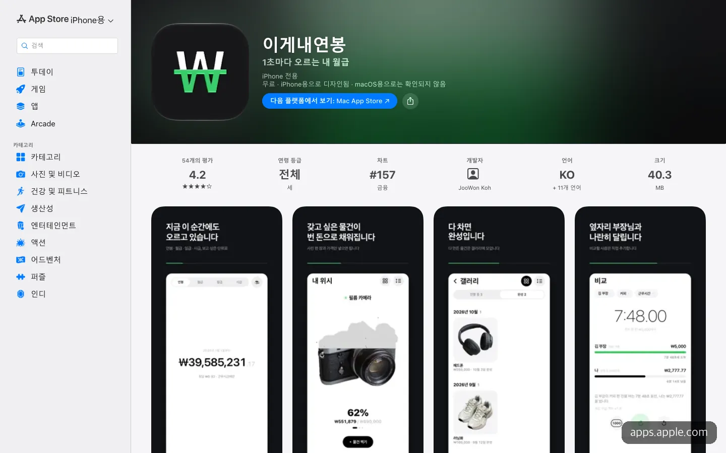
The App Store screenshots do not show the ad banner.
The biggest difference is the ads. The screenshots show a clean black screen, but in the actual app a long horizontal banner is always attached right below the bottom tab bar. Banners for a shopping mall, a car digital key and a brokerage promotion took turns from screen to screen, and we saw no full-screen ads or pop-ups. We did not touch the phone’s home screen this time, so we could not check the widgets. StandBy is originally an iPhone feature, so on Android the stand mode appears to take its place.
The same idea already exists in several forms
A per-second salary counter is not a new invention. Some apps and websites may have come out before Ige Nae Yeonbong, so it is hard to say which one is the original. Going only by what we confirmed as of November 2026, it looks like this.
| Name | Form | Price | Notable points |
|---|---|---|---|
| Ige Nae Yeonbong | iPhone and Android app | Free, banner ads | Coffee race comparison, Wish, working-hours mode, 54 App Store ratings |
| Wolgeup Rupang (Free Rider) | iPhone app | Free, no ads | Money earned today, income per second, payday D-day, 1 rating |
| Wolrumeter | Web | Free | Converts break time into money, Top 5 slacker ranking of the day |
| Payday Countdown | Web | Free | Real-time earnings counter, Elon Musk comparison mode |
| SalaryTicker | Mac menu bar, open source | Free (MIT) | Shows money earned since the last payday, updated every second |
If you just want to get a feel for it without installing anything, the web tool Wolrumeter fits. With the default monthly pay of 3 million won, pressing “Start slacking” piled up ₩64 in 13 seconds. It lacks the appeal of carrying your own number around, the way Ige Nae Yeonbong lets you.
The one most worth noting is Wolgeup Rupang (“Rupang” comes from Lupin, and “wolgeup rupang” is Korean slang for someone who collects a salary while slacking). Many of its features overlap, it has no ads, and yet it has only one rating. Even with the same idea, whether a Reel existed made the difference. Seen the other way around, what protects Ige Nae Yeonbong is not its features but its present buzz.
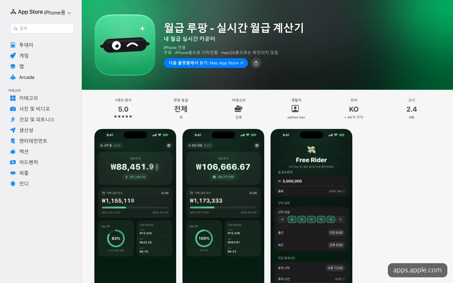
Wolgeup Rupang, a free, ad-free app that shows money earned today and income per second. It has just one rating.
Why one banner is hard to live on
From our own use, the app made money in just two places: the banner at the bottom of the screen, and a Settings menu that turns ads off for 12 hours if you watch an ad. We found no product anywhere that removes ads or unlocks features for a payment. Even ad removal works by watching one more ad, so the income source is effectively ads alone.
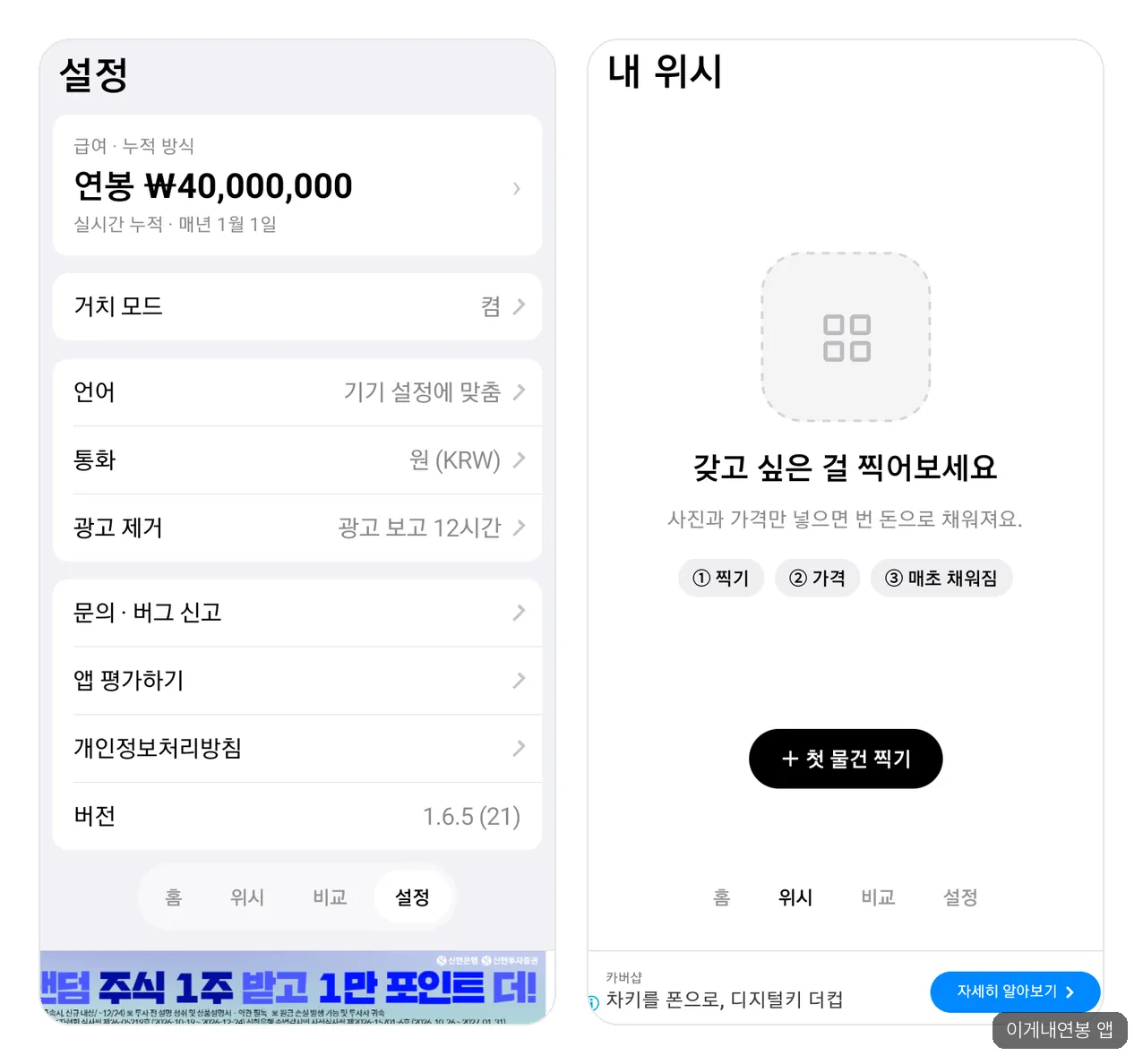
From left: Settings and the Wish tab. Ad removal means watching an ad to turn ads off for 12 hours, and both screens have a banner at the bottom.
The core screen is one you look at and close. The Home screen with the climbing number does carry a banner. The problem is that there is nothing to do on that screen besides watch the number. After a few seconds it feels empty, and you close the app. According to Google AdMob documentation, a banner refreshes only while it is visible on screen. When people stay briefly, the banner gets fewer chances to rotate.
The longer people use it, the more they leave the app. The iPhone version promotes home and lock screen widgets and StandBy, but Apple’s App Review Guidelines 2.5.18 says display ads belong only in the main app, not in widgets. Steady users end up checking the number on a widget instead of opening the app, so the more they use it, the fewer ads they see.
Adding ads hurts reviews. The version history shows “banner ad reduction” on September 20 and “ad frequency adjustment” on October 17. Right when crowds arrived, the developer actually cut back on ads. With free, ad-free alternatives one table row away, users simply move on if the ads annoy them.
It is not a structure for making money from data either. The app’s promise is that there is no sign-up and pay data never leaves the device. That is reassuring for users, but it closes off from the start any path of collecting information and linking it to another business. One thing to note is that the privacy section on the same App Store page lists location, identifiers and usage data as data used for tracking. Developers enter those values themselves and an ad tool may be the cause, but the reason has not been confirmed.
EasyTicket’s judgment is this. Features people would pay for are already piled up in the reviews. There are requests to convert pre-tax salary into take-home pay, requests to enter different working hours for each weekday along with overtime pay, and complaints that amounts of 100 million won or more cannot be entered. The developer replied that they would add these to the next task list and review them. Bundling “calculations that fit my situation” or a paid ad removal into a paid tier looks like a more realistic path than the tug-of-war of adding and removing banners.
Disappointments from using it
The banner sits too close to the tabs. The banner is attached right below the bottom tabs (Home, Wish, Compare, Settings), close enough that you might hit an ad while reaching for a tab. We found ourselves moving a finger carefully to avoid tapping the ad.
Wish cannot get started without a camera. The feature that stands out most in the App Store screenshots is Wish, where a camera photo fills up to 62%, but the actual Wish tab starts with a single ”+ Photograph your first item” button. It requires taking a photo, so we could not use it all the way through this time. For someone who quietly opens the app at their desk at work, that is a barrier.
There is little reason to open it the next day. The number rises the same way every day, and once you run the comparison race a couple of times you know the result. For people who arrive through a Reel, recreating the scene from the video once means the goal is met, so the app needs a reason for them to open it the next day too. The updates every few days seem to be a fight against exactly this problem.
One Reel succeeded in catching the eyes of 5 million people. The test that remains is getting those people to come back for this number the next day, and revenue will follow only after that.
Frequently asked questions
Is Ige Nae Yeonbong free?
Yes, it is free. As of November 2026 there are no paid products, and a banner ad appears at the bottom of the screen. If the ads bother you, you can watch one ad in Settings to turn them off for 12 hours.
Is the salary I enter sent anywhere?
The app description says pay is stored only on the device and there is no sign-up. In our own use, no sign-up or permission request appeared either. However, the App Store privacy section lists location, identifiers and usage data as used for tracking, so if that concerns you, it is worth reading that section first.
Can I make an app like this myself?
Going by the features alone, it does not look hard. The author of the web app Payday Countdown, posted on GeekNews (a Korean tech news site), said they made it simply with help from Claude. The hard parts are not the building but getting buzz from a single Reel, and then earning money after that.
Sources 7
AI helped with research and the first draft; the operator tried the subject firsthand, checked and edited this article before publishing. Let us know if you spot a mistake.