
On October 8, 58 people downloaded STASH on iPhone for the first time in a single day. Then, from October 10, when I turned the ads off, it dropped to 0 to 5 a day. STASH is a free app that an EasyTicket developer built through vibe coding. It collects the screenshots, links and places you save to look at later in one spot, and you sort them by swiping cards sideways. It went live on the App Store and Google Play in early October 2026.
It was the app I put the most care into, and when I launched it, I honestly thought it had turned out well. This is a record of the month it spent in a red ocean, a market already crowded with competitors.
Why build in a red ocean
It started with one short post on Threads. It said a blue ocean isn’t really a blue ocean, just a market that doesn’t exist. I agreed. If people already pay to use something in a market, even a small foothold there can make money. That was my calculation.
Around the same time, the screenshot organizer Clutter kept showing up in my Threads feed. It had gone viral, and as of November 1, 2026, it had a 4.9 rating from 973 reviews on the Korean App Store. Several reviews say things like “I downloaded it after seeing it on Threads.” It was proof that people really want help sorting screenshots.
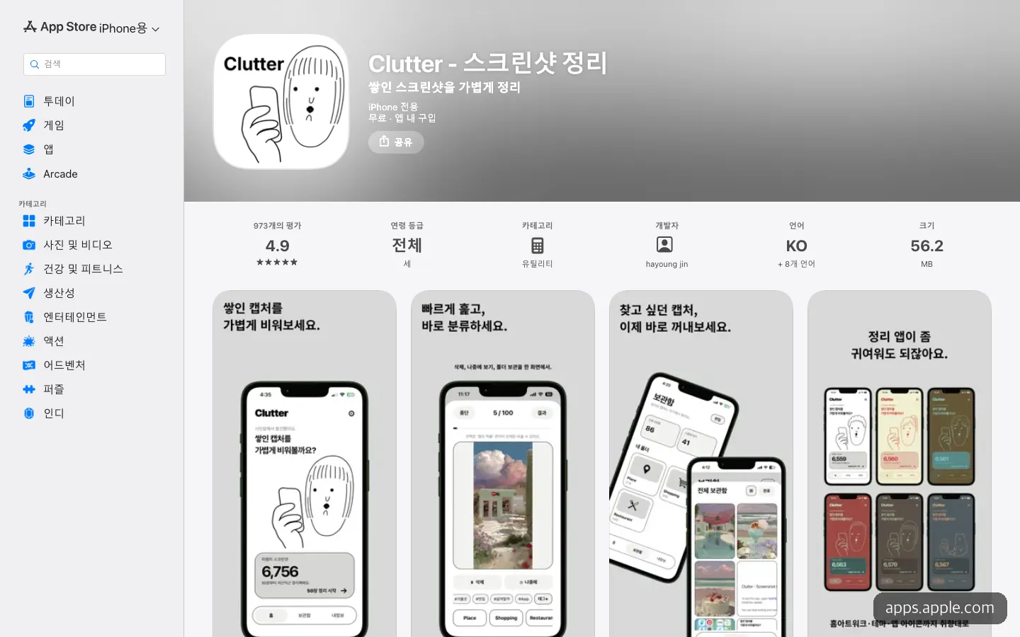
Clutter, the leader of the red ocean, with 973 reviews piled up.
So I downloaded and tried several other screenshot organizers. My impressions fell into two camps: too complicated to use, or too thin on features. Many of them handled only screenshots, but screenshots aren’t the only things piling up on a phone. There are also links saved from Instagram and restaurants pinned on a map. I figured an app that organizes all three in one place, intuitively, could squeeze into a gap.
What kind of app is STASH
The core screen is the “Sorting Box.” Items that haven’t yet gone into a collection appear one at a time as full-screen cards. Swipe sideways to put one in a collection, or flick up or down to leave it where it is. New screenshots land in the Sorting Box automatically, and because the text inside them is read on the device, you can find a capture with a single word like “Jeju.”
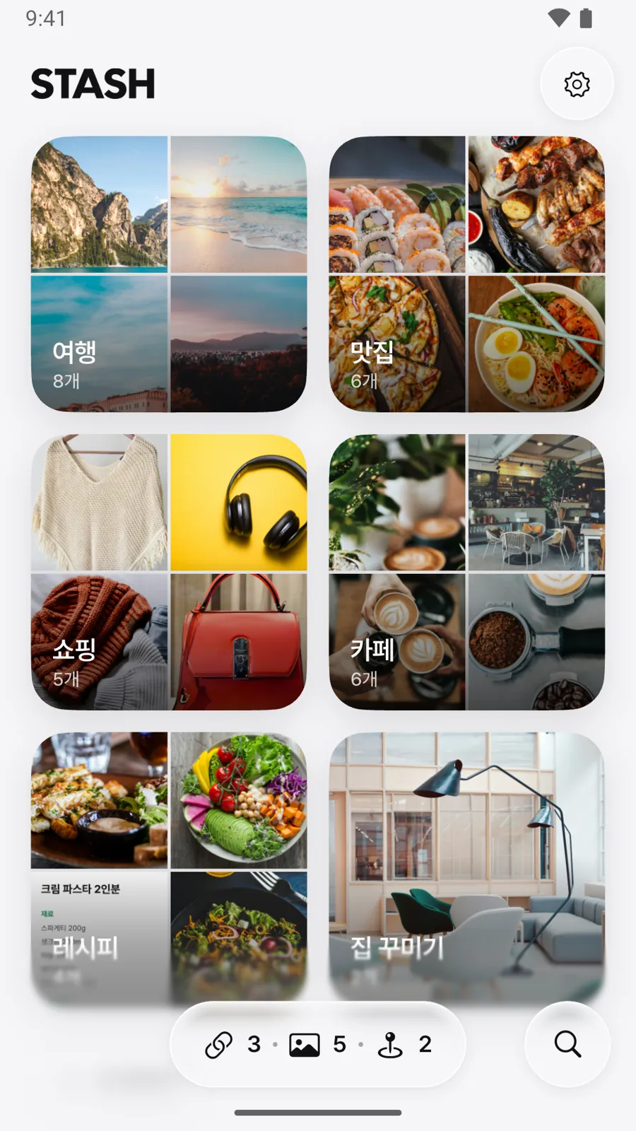
STASH home. The photos in each collection become its cover, and the glass buttons below show the number of links, screenshots and places.
Just tap the share button in another app, and the link is saved with its photo and title. Links shared from Naver Map, KakaoMap, Google Maps and Apple Maps become “places” with a name and address, gathered on a map. There is no sign-up, and everything you save stays on your phone (nothing is uploaded to a server).
It’s free (with ads). STASH Pro is a one-time purchase (4,900 won), not a subscription, that removes ads and unlocks diagonal swiping, export and import, and sending a whole collection at once. The app’s text comes in six languages: Korean, English, Japanese, Chinese (Simplified and Traditional) and Vietnamese.
Glass screens and a rule against deleting
This time I resolved to build it properly. I decided on a glass look for the design from the start. When Apple announced Liquid Glass in June 2025, it made controls look like a translucent layer floating above the app, and I followed that approach. As Apple’s guidelines advise, I used glass only on floating controls such as bottom buttons, top buttons and menus, never on photos or text. I built both the iPhone and Android versions with Flutter alone, and generated visuals such as the icon with AI image generation.
The glass was where I got stuck the longest. Drawing a single home screen took 44 rendering steps, versus 22 when the same screen was drawn at normal quality. One glass effect doubled the work. Instead of lowering quality on every device, I solved it by dropping the glass quality one level only when a device couldn’t keep up with the screen, then restoring it once there was room to spare. There was also a problem where, as a screen slid in, a gray blob lingered a beat too long where the refracting glass should have been. I settled it by using glass without refraction while things are moving and on sheets that rise from the bottom.
The biggest change in planning was “deleting.” Before launch, I looked at 15 screenshot organizers on the App Store and Google Play, and not one deleted the original photos in your library by default. One app that had added automatic deletion had reviews full of reports of lost photos. So I made deleting the originals happen only when the user chooses it, and even then it goes to the trash (Recently Deleted).
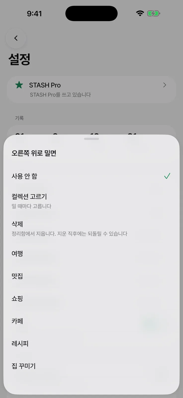
The screen where you set an action for each swipe direction. Even if you pick delete, it removes the item only from the Sorting Box and can be undone right away.
I cut some things too. I added a feature to hide screenshots in the photo library, then removed it and left only a guide when I realized the iPhone Photos app and Google Photos already have such settings. I also considered Google Drive backup and sync, but decided that sync going wrong in an app that handles photos was too risky, so I put it off. Instead I added exporting to a file and importing from one.
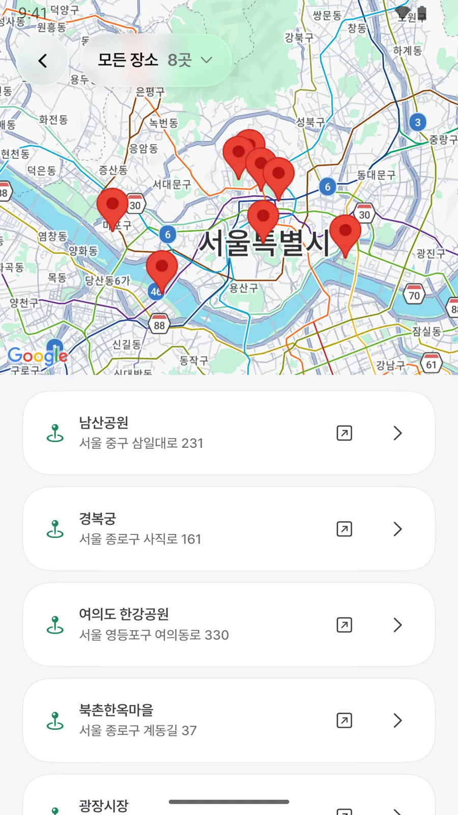
Links shared from map apps are saved as places with a name and address and gathered on the map.
The first month: 376 people downloaded it across two stores
I promoted the app in two ways. I ran Meta ads, and I kept introducing the app on Threads. Here are the results for October.
- App Store (October 1 to 31): 312 first-time downloaders, and 19 re-downloads after deleting
- Google Play (October 1 to 26): 64 new installers, 30 people who uninstalled, and 42 devices with the app installed as of October 26
- New downloads across both stores combined: 376
Of the 312 on iPhone, 202 were in Korea, followed by 21 in the United States and 13 each in India and Taiwan. On Google Play, the painful part is that nearly half of the people who installed it deleted it.
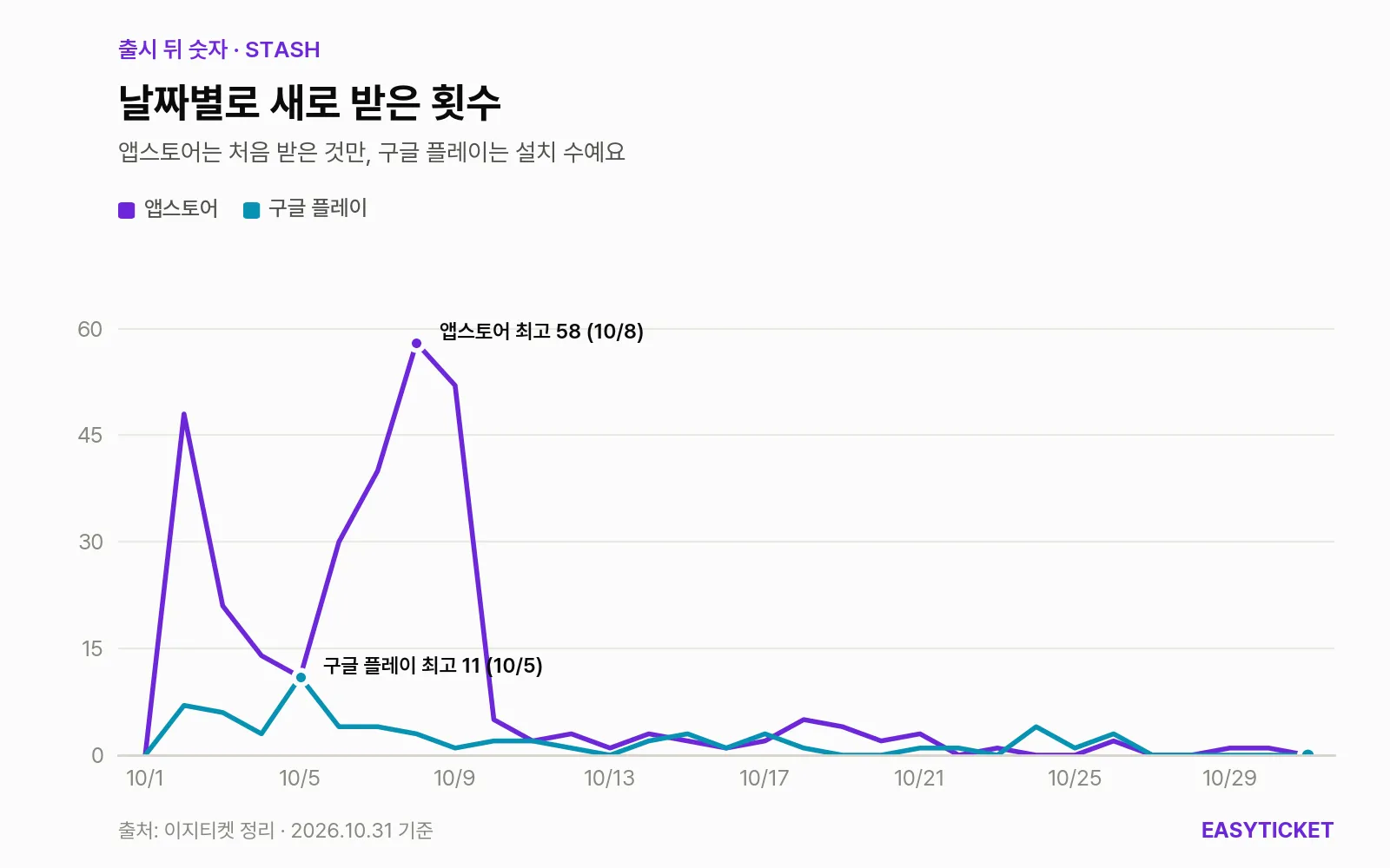
New downloads by day over October. They cluster in the first week the ads ran and stick to the floor after they were turned off.
The shape of that graph tells the story of the app’s month. During the ad run from October 3 to 9, first-time iPhone downloads averaged 30.6 a day. From October 10 to 12, after the ads were off, they averaged 2.0, and from October 13 to 22, after the update came out, 2.2. I spent a total of $191.12 on ads, about 260,000 won at 1,380 won to the dollar. That bought 33,597 impressions and 1,735 link clicks. In the same period, in-app ads earned 4,884 won (October 2 to November 1).
It isn’t that the people who downloaded it dropped it right away. In October, 411 people opened the app, each opening it 2.7 times on average for 8.1 minutes. As of October 31, 357 people had opened it in the past 28 days, 81 in the past 7 days, and 11 that day. Both reviews with written comments gave 5 stars, so the reaction from people who tried it was quite good. The problem was new people coming in.
Losing in search, and a name that was already taken
The only way to bring people in without ads is store search. That is why search terms were what I touched most after launch (polishing an app’s name, subtitle and keywords is called ASO, or app store optimization). Before launch, I researched search terms in eight markets to set a name and subtitle for each language, and I changed the App Store name from “STASH” to one with search terms attached. I also made three custom product pages (Sorting Box, Save, Places), each with a different set of the first three screenshots for different search terms.
Looking at the Korean App Store rankings on October 10, the results were mixed. For “스샷 정리” (a Korean shorthand for sorting screenshots) and “stash,” it ranked first, and for “맛집 저장” (save restaurants) and “나에게 보내기” (send to myself), second. But for “스크린샷 정리” (organize screenshots), the term people type most, it was 22nd, and for “링크 저장” (save links), 27th. On the same day, Clutter, at the top for “스크린샷 정리,” had 925 ratings. On Google Play, STASH didn’t make the top 30 for “스크린샷 정리,” so I rewrote the title to put the target phrase first. The current App Store name has also been reordered to “STASH : 스크린샷 정리, 링크 저장” (STASH: Organize Screenshots, Save Links).
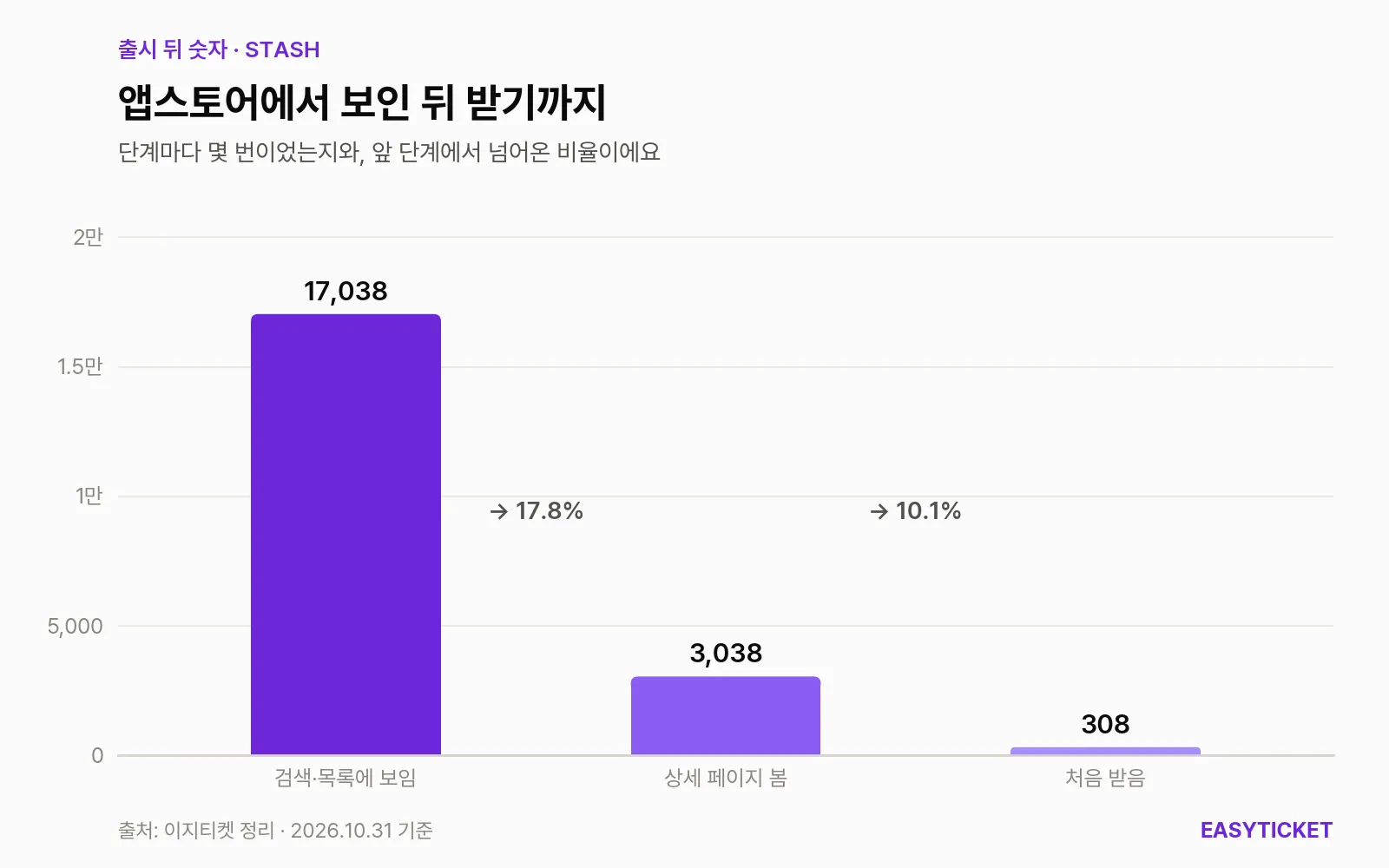
How the numbers shrink at each step from being noticed on the App Store in October to being downloaded.
In October, STASH was seen 17,038 times on the App Store, and its detail page was opened 3,038 of those times. That works out to about one download for every ten people who viewed the detail page. I think the rating was a big reason people opened the page and left without downloading. On October 10, the Korean rating was an average of 3.4 from 5 ratings, and three low-star ratings with no written comments dragged the average down. After the update the ratings started over, and now just one remains, at 5.0. When I measured again on October 24, the number of search terms where STASH appeared on the first search screen had fallen from 27 to 10.
There was one more wall I hadn’t known about: the name. I had asked AI for a few name candidates and picked one, but “Stash” was already in use in three ways: a screenshot organizer, a bookmark app, and two SnapStash apps from different companies. I only learned after launch that in a red ocean it’s easy for an app’s name to overlap with others.
| Korean App Store, November 1, 2026 | STASH | Clutter |
|---|---|---|
| Ratings | 5.0, 1 rating | 4.9, 973 ratings |
| What it organizes | Screenshots, links, places, notes | Screenshots |
| Price to remove ads | One-time purchase, 4,900 won | Lifetime pass, 3,900 won |
| Devices | iPhone and iPad, Android | iPhone |
| App size | 156.5MB | 56.2MB |
| Latest version | 1.0.3 | 1.4.3 |
On the feature rows alone, STASH does more. But what people look at first when choosing an app is the number of ratings. Clutter isn’t a perfect app that rose on merit alone, either. Some reviews complain that it lets you review only 50 images at a time and shows an ad at the end of each batch. Still, the developer replied to reviews and shipped frequent updates, and the ratings piled up. The order was: get known first, collect reviews in proportion to how well known you are, and let those reviews push the search ranking back up. Its hand-drawn character icon, which people remember, is another place where it’s ahead of STASH.
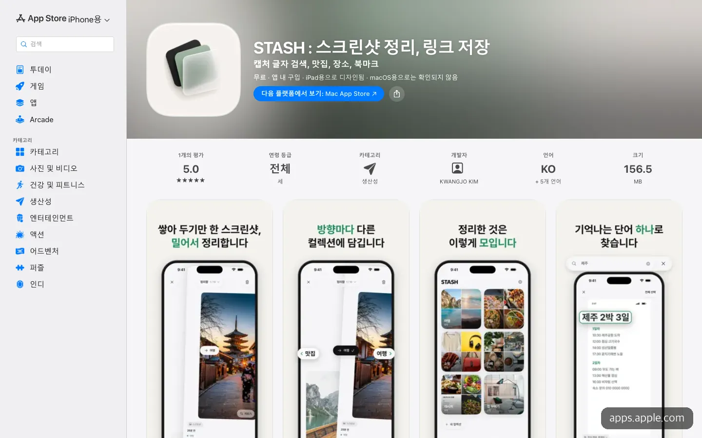
The current store page, polished with search terms toward the front of the name. It still has just one rating.
Promotion on Threads didn’t reach as far as I’d hoped, either. Posts introducing the app didn’t get much exposure. Of the 756 people who visited the intro page in October, 422 came from Meta ads and about 185 from Threads. I hadn’t tagged the store links, so I also regret that I couldn’t count how many people actually installed the app after seeing it on Threads.
What to fix next, starting with reach
I shipped three updates after launch. Version 1.0.1 added saving videos and screen recordings and attaching directly from other apps, 1.0.2 fixed an iPhone crash, and 1.0.3 added a + button at the lower left for adding links, camera shots and notes directly. The app keeps getting better, but the number of people downloading it stayed the same. So what comes next lies outside the features.
- Collect reviews first. I think the gap between 1 rating and 973 sent people back from the detail page. Asking for a rating only from people who have finished sorting a few times comes first.
- Find out why people delete it on Google Play. Of 64 installers, 30 deleted it. I plan to start by checking whether the 156.5MB size or the order in which it asks for photo library permission on first launch is the snag.
- Stand out with the words next to the name. The name itself overlaps with others, so it’s more realistic to hold first place in small search terms, like “save links” or “save restaurants,” where it has already climbed to second.
- Build influence. This is the biggest lesson of the month.
In a red ocean, few people found the app through organic search, because apps that had already done well hold the top of the results. So STASH prompted me to start an EasyTicket Instagram account, and I made up my mind to become well known. There’s no post about STASH yet, but when I saw another web app Reel I posted on October 25 pass 410,000 plays, I became confident the direction was right. In an era when anyone can build an app with AI, the power to show what you’ve made matters more than the speed of making it.
Frequently asked questions
Is STASH free?
You can download and use it for free, with ads. To remove ads and unlock features like diagonal swiping and export, you can make a one-time purchase of STASH Pro (4,900 won). It is not a subscription.
If I sort my screenshots, are the originals in my photo library deleted too?
Not by default. The originals are deleted only when you choose it yourself, and even then they don’t vanish right away. They go to the photo library’s trash (Recently Deleted).
If I change phones, will what I saved move over?
There is no account or server sync, so it doesn’t move over automatically. You create a file with STASH Pro’s export, then import it on the new phone.
Can I build an app like this alone with vibe coding?
For STASH, one developer built the iPhone and Android apps with Flutter alongside AI and released them on both stores. Building it was something I could do alone. The harder part was letting people know about it after launch.
Sources 6
AI helped with research and the first draft; the operator tried the subject firsthand, checked and edited this article before publishing. Let us know if you spot a mistake.